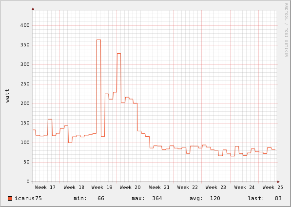
Here's a snapshot of our 'night' chart taken in the spring of '09. The data points on the Flukso night chart are calculated by taking the average electricity consumption between 2AM and 5AM local time. The chart gives us a good approximation of our household's 'leak power', i.e. the power that is being consumed by the house with no noticeable activity by its inhabitants. We can discern three periods on the chart. Weeks 17 and 18 show us an average nightly consumption of 130 watts. Week 19 and 20 show a sudden surge in the number of watts being used, to approximately 220 watts. The third period spans weeks 21 through 25 during which we observe a drop to about 80 watts.
 Night Chart
So can we tie these regions to events occurring in our house? Yes, we can. We swapped our old fridge for a brand-new, more efficient type at the start of week 21. This explains the drop of roughly 50 watts between periods one and three. The cause of the surge during period two wasn't that easy to explain at the time. We accidentally left our cellar light burning, an incandescent light bulb of 100 watts. Looking at this chart during week 20 made us realize we had an abnormal consumption. It took us a while to actually find what was going on, but without this type of visualization we might not have noticed this burning light bulb for another couple of weeks. This is one concrete case where monitoring your consumption can lead to a reduction in the electricity bill.
Note: We've added some Flickr-style annotations for the chart in this blog. Just roll your mouse over the area to view the comments on the chart.
